ShopDreamUp AI ArtDreamUp
Deviation Actions


Suggested Deviants


Suggested Collections


You Might Like…


Featured in Groups


Description
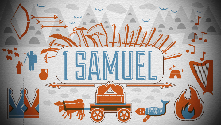
Created in Illustrator. The debossing on the paper was done in Photoshop.
To create this I pretty much scanned through the whole book of 1 Samuel and wrote down the imagery that stood out to me. Then I tried to pile as much of that imagery as I could in this graphic. The book of 1 Samuel records the beginning of Samuel's life (he was a prophet and judge over Israel) the rise and fall of King Saul, and the rise of King David.
I think this is my first try at an "overprint" look. I hope you enjoy. (Smile)")
The font came from this site: Lost Type [link] They have lots of cool fonts.

To create this I pretty much scanned through the whole book of 1 Samuel and wrote down the imagery that stood out to me. Then I tried to pile as much of that imagery as I could in this graphic. The book of 1 Samuel records the beginning of Samuel's life (he was a prophet and judge over Israel) the rise and fall of King Saul, and the rise of King David.
I think this is my first try at an "overprint" look. I hope you enjoy.
The font came from this site: Lost Type [link] They have lots of cool fonts.
Image size
720x406px 341.58 KB
© 2012 - 2024 Emberblue
Comments47
Join the community to add your comment. Already a deviant? Log In
What I like about this piece is the fact that, if you know 1 Sam (like I do), you can actually recognise the images/references immediately: it is very clear, without being too explicit or dramatic.
Per example: I especially like the broken statue and sores+mice; it's not symbolic -because these literally appear in the story, but it is iconic -they represent that part of the story with great effect. (That part was subject of a paper I did with some friends).
And ofcourse David and Goliath!
I love how you made clear it is about war/battle, without making it very graphic. The chosen style prevents offense (which could be expected from the violence), without shying away from the subject.
I consider it to be a balanced work on several levels:
-the contrasting colors, and neutral gray;
-the way the style fits the colors;
-the contrast between the (nature of the) subjects and the style, whilst directly representing those subjects (:the balance between explicit and implicit)
-it is filled to the brim with seperate (story-)elements, without those distracting from the whole.
I have to admit that I'd like to give you advise on how to become even better, but I can't find any actual flaws.
Perhaps keeping this up will help you improve?
Though, a possible point for you to improve upon would be that not all parts of 1 Sam are reflected.
But I wonder if that is possible; can you add more elements without those being crammed into the work? And would they be represented equally effective, even though those images did not stand out that much to you?
What I can say is this: great job, keep up the good work!
[Vision: several small themes and an encompassing theme are reflected/presented with great effect.
Originality: a fresh way to present these serious themes in a playful yet revealing way.
Tech: the work is skillfully created and knowledge of the medium is exhibited, both by the effective usage of the style.
Impact: it's quite clear this artwork has great impact on me <img src="e.deviantart.net/emoticons/w/w…" width="15" height="15" alt="